Earth Got Influencers, the Moon Got Nothing: A Brand Audit 238,900 Miles Up
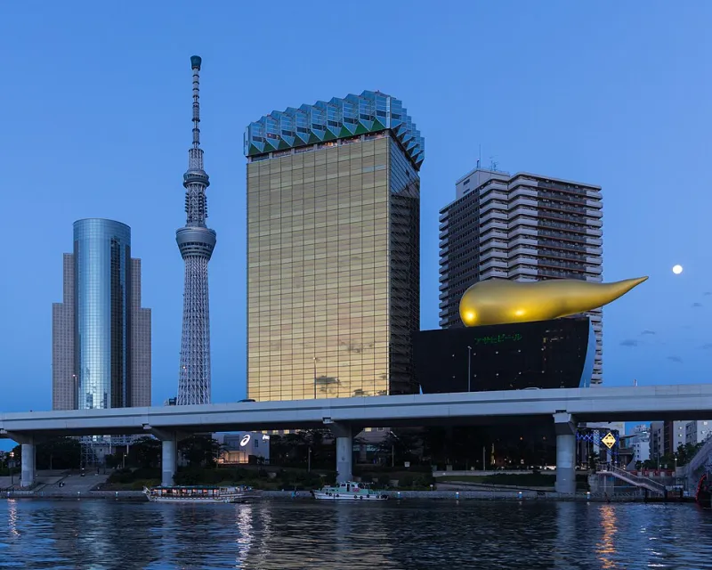
Photo: Basile Morin, CC BY-SA 4.0, via Wikimedia Commons
It started the way most of my projects start: with a screenshot I had no business taking.
I was scrolling Instagram at 1 a.m. — the designer's natural habitat — and my feed was a wall of personal brands. Sunset-lit yoga retreats. A guy in Austin who sells sourdough starter as a lifestyle. Someone's golden retriever with a newsletter and, presumably, a media kit.
And then I looked out the window at the moon, hanging there like a peeling sticker, and it hit me: the most photographed object in human history has no brand identity. Not a logo. Not a Pantone chip. Not so much as a tagline.
Earth has influencers. The moon has craters.
I opened Figma. This was a mistake, but it was going to be my mistake.
The Audit Nobody Asked For
Every rebrand starts with an honest assessment of the current state, so let's be brutal: the moon's existing identity is, frankly, a mess.
- Name recognition: Elite. Five stars. Everyone knows the moon.
- Visual consistency: Nonexistent. It shows up as white, gray, orange (harvest moon), blood red (once a year, very dramatic, no follow-through), and occasionally as a flat disc behind a cartoon cat.
- Voice: Silent for 4.5 billion years. In branding terms, that's not mysterious — that's just bad community management.
- Merch: Zero. The moon gets slapped on other people's merch constantly and sees none of the licensing revenue. If I were the moon's lawyer, I'd be filing suit.
The moon has been coasting on name recognition since before the concept of coasting existed. That ends today.
The Logo
The obvious move is a crescent — but a crescent is a phase, not an identity, and the moon is more than its angles. (A lesson for all of us.)
So I designed a mark based on the terminator line — the soft boundary between lunar day and night. It's a single brush-like arc, slightly imperfect on purpose, because the moon's whole deal is that it's a lumpy rock and it's thriving. The arc sits inside a circle only when it needs to behave on social media. Otherwise it floats free, like the moon itself, which refuses containment.
Working name: The Nod. Because the moon is always angled toward us. It's been nodding at Earth for millennia and we've never once nodded back. Rude.
The Palette
No, it's not gray. Gray is what happens when a brand gives up.
The primary is Regolith — a warm bone-white with just enough cream in it to feel like an heirloom, not a hospital. The secondary is Terminator Blue, that deep indigo band where day tips into night, the exact color of the sky five minutes after the moon shows up early to the party. The accent — and I will die on this hill — is Sea of Tranquility Copper, pulled from the faint oxidized tint in lunar photographs that everyone else was too cowardly to notice.
Together: warm, quiet, a little melancholic. The moon's brand should feel like the last stretch of a late-night drive with the windows cracked. If the palette doesn't make you slightly wistful about someone you haven't texted back, I've failed.
Typography and the Sound of the Moon
The wordmark is set in a custom sans I'm calling Perigee — geometric, wide-tracked, with one quirk: the lowercase 'o' is very slightly off-center, because the moon's orbit is elliptical and I refuse to let typography lie about orbital mechanics.
For the sonic identity — yes, the moon needs a jingle, and no, I will not be taking questions — imagine a single sustained note that fades rather than ends. The moon doesn't stop; it wanes. Every brand sound should wane. I'm looking at you, every app notification that just cuts off like a door slamming.
The Tourism Campaign
The moon has been the world's most under-marketed destination for all of recorded time. So here's the launch campaign, ready for the moment lunar tourism gets its act together:
"Come for the view. Stay because there's no Wi-Fi."
Supporting executions include a print series of the moon's "amenities" — zero humidity, unmatched stargazing, a 14-day return policy on every sunset — and a billboard over the interstate that's just the moon, full-frame, with the line: "You've seen me in every breakup song. Time we met."
There's also a redesigned lunar flag, because the current solution — six American flags, presumably sun-bleached into anonymity by now — is less a brand presence and more a group project nobody documented. The new flag is simply The Nod on Regolith. No text. The moon doesn't need to introduce itself.
The Merch (Because Obviously)
A limited capsule, available only when I say it is:
- A Regolith-white mug with The Nod on the bottom, so you only see it after the last sip
- A tote that says "FULL ALL MONTH"
- A sweatshirt in Terminator Blue with SEA OF TRANQUILITY arched over the chest like a college that doesn't exist
- A poster of the moon phases re-labeled as a content calendar: New Moon — posting nothing. Rest is strategic.
A Strongly Worded Letter to the Cosmos
Here's the thing that started as a joke and got weirdly sincere around 2 a.m.: we live in an era where every person, dog, and sandwich has a brand strategy, and the moon — the thing every human who ever lived has looked up at — has nothing. No mark. No voice. No merch. It just shows up, does the tides, and leaves.
Maybe that's the brand. Maybe the moon is the last anti-influencer: total saturation, zero self-promotion. In which case my rebrand isn't a fix — it's a fan letter. A logo-shaped thank-you note for every night it showed up when nothing else did.
Either way, the moon now has a style guide. It lives in a folder on my desktop called "moon_final_v14_REAL."
Somebody had to do it. Nobody stopped me. Again.